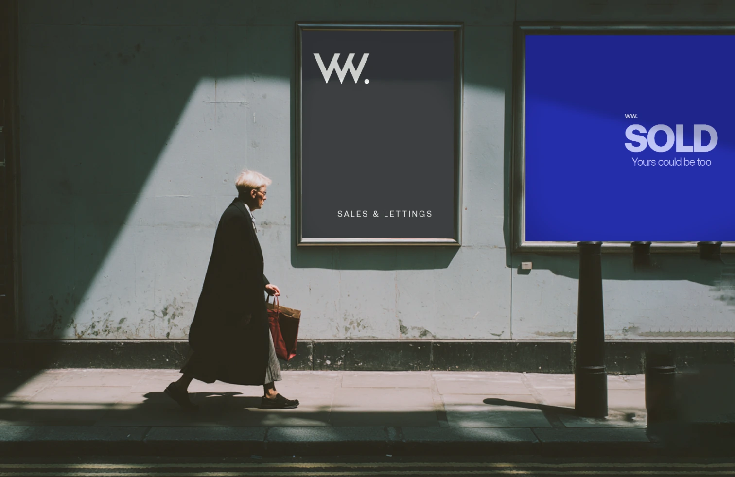
WW Estate was reimagined through a comprehensive brand refresh aimed at modernizing the agency's presence while reinforcing its connection to the communities it serves. The objective was to create a distinctive identity capable of standing out within a highly competitive property market while maintaining trust, professionalism, and local relevance.
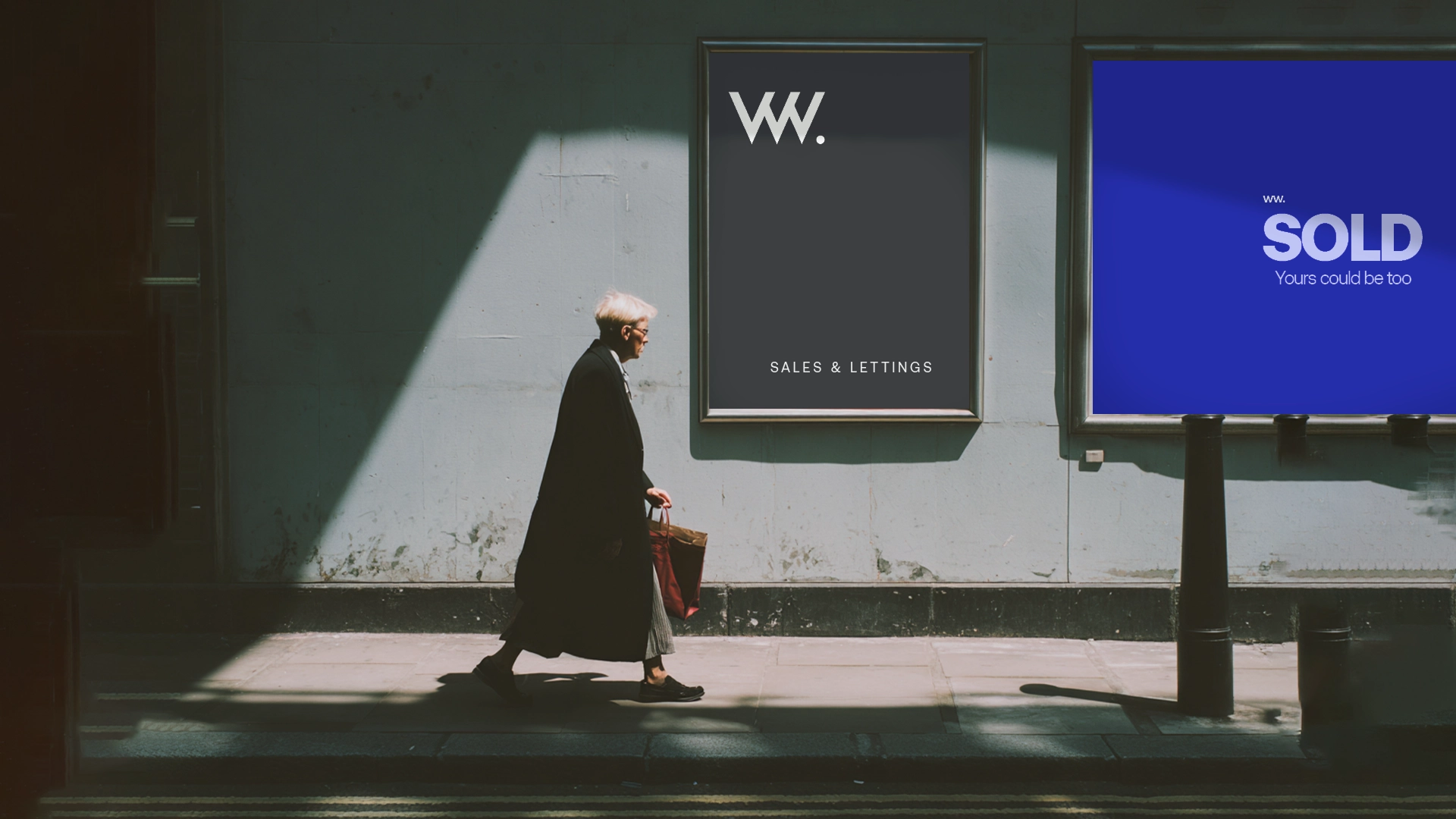
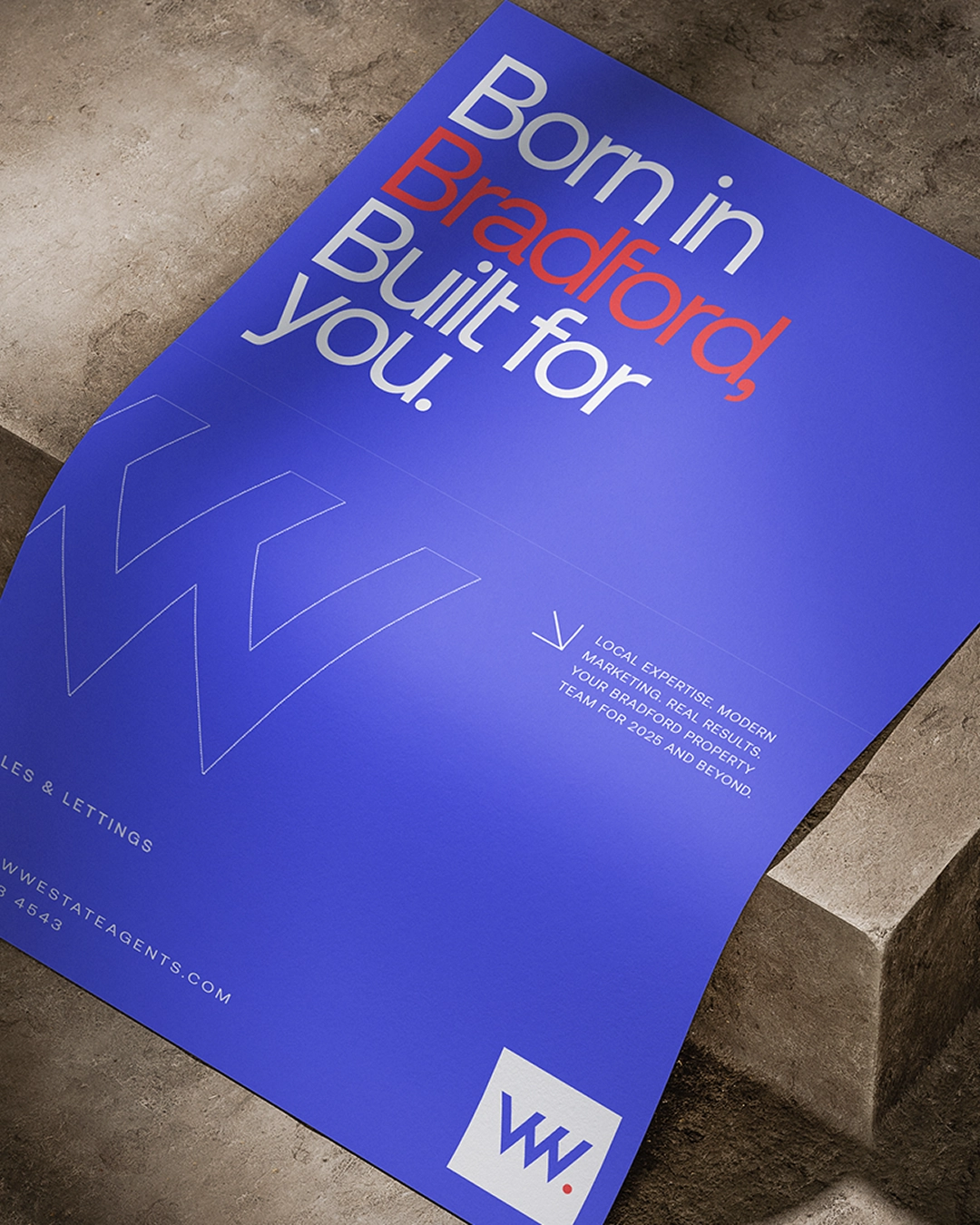
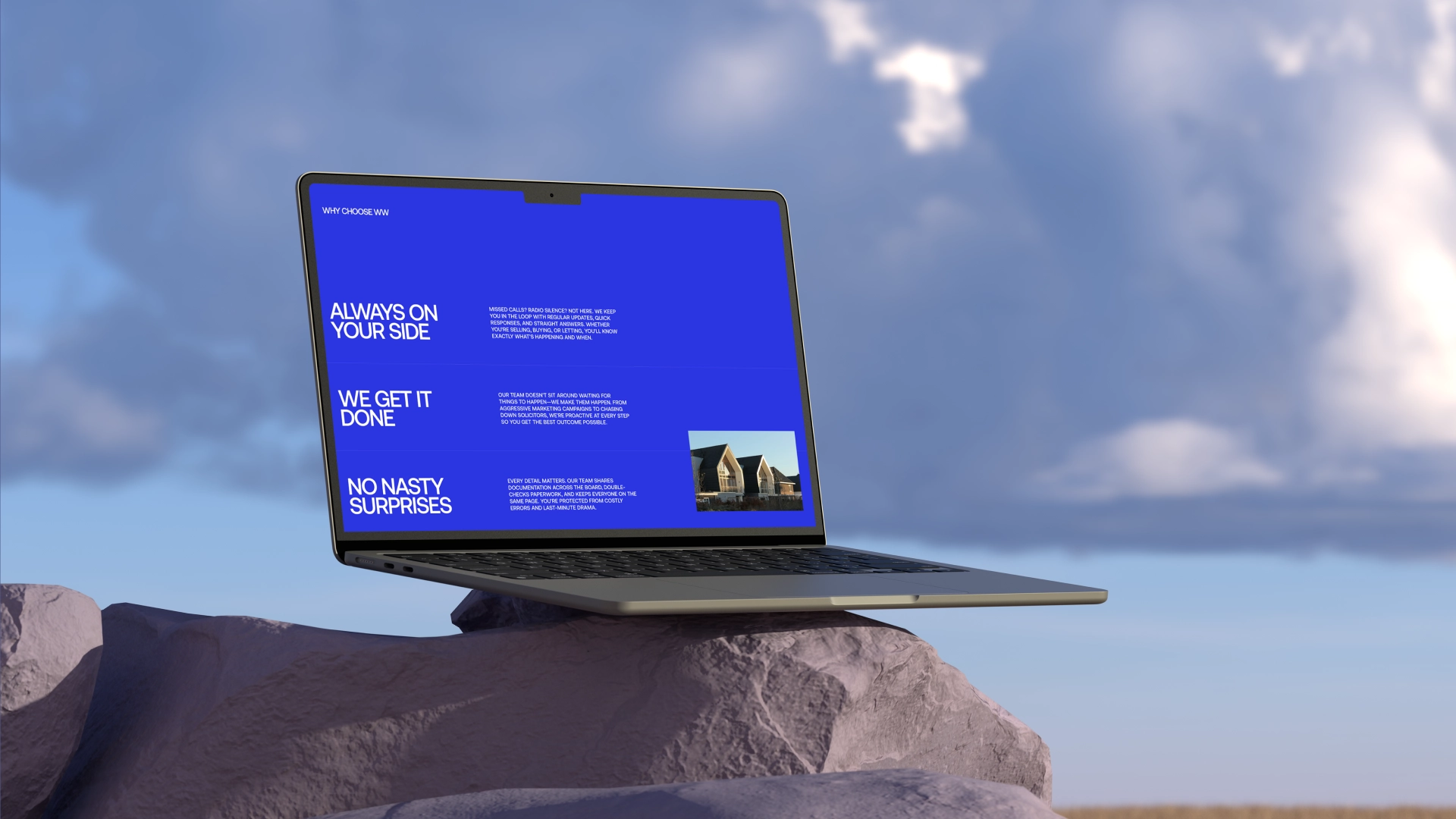
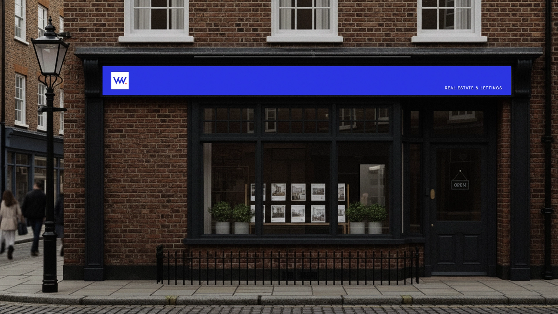
The new visual system centers around a simplified monogram, a confident color palette, and a flexible design language that adapts across storefronts, property signage, advertising campaigns, stationery, and digital communications. Combined with a more contemporary brand voice, the identity creates a stronger and more recognizable presence across every customer touchpoint.
Designed to communicate both credibility and approachability, the system balances modern aesthetics with the practical needs of a real estate business. The result is a brand that feels confident, memorable, and deeply connected to its local market while providing a scalable foundation for future growth.
The work was done under Trickleup.
WW Estate
A rebrand for a UK-based real estate agency focused on creating a more distinctive, modern, and community-driven identity. The project introduced a bold visual system and refreshed brand positioning designed to strengthen recognition across physical and digital touchpoints.
WW Estate was reimagined through a comprehensive brand refresh aimed at modernizing the agency's presence while reinforcing its connection to the communities it serves.
The rebrand features a simplified monogram, bold color palette, and a versatile visual system designed to work seamlessly across print, signage, and digital platforms.